A well-designed website is one of the most powerful tools an RV park can have. The website is often the first impression potential guests get of the park, and it can make or break their decision to book. A site with slow load times, clunky navigation, or confusing booking options will keep visitors away. On the other hand, a modern, user-friendly website builds trust, provides key information easily, and simplifies the reservation process.
In this article, we’ll highlight the best RV park websites that stand out for their design, functionality, and ease of use. These examples will give ideas and tips for campground owners or operators to help build a new website or improve the current one.
Key Takeaways
- A well-designed RV park website should focus on user-friendly navigation, mobile optimization, and fast load times to improve the booking experience.
- Compelling visuals, clear CTAs, and strong branding help create trust and encourage reservations.
- SEO optimization and accessibility features make websites more visible and inclusive for all travelers.
- Interactive maps and streamlined booking systems enhance the user experience and simplify the reservation process.
- Tools like WordPress, Wix, and RoverPass Premium Website Service can help campground owners build and improve their websites efficiently.
What Makes an RV Park Website Stand Out?
A great RV park website does more than look good—it creates an effortless experience for visitors. Your website should be designed to give them all the answers they have from your campground from the moment they click on it. Here are the key features that make a website truly stand out:
User-Friendly Navigation
Guests should be able to find what they need quickly. A clear, well-structured menu with easy-to-read sections helps visitors browse rates, amenities, and booking options without frustration.
Mobile Optimization
More than 60% of travelers browse and book campgrounds from their smartphones. A mobile-friendly site ensures that all elements adjust seamlessly to any screen size, making it easy for guests to explore and book on the go.
Fast Load Time
A slow website kills conversions. Visitors expect a site to load within three seconds—anything longer, and they’re likely to leave. Compressing images, using fast servers, and minimizing heavy design elements will keep loading times quick.
Clear Calls to Action (CTAs)
Buttons like “Book Now” or “Check Availability” should be easy to find. Strong, visible CTAs encourage visitors to take action immediately, reducing the chance they leave without making a reservation.
Accessibility & Color Choice
A good RV park website should be inclusive for all users. This means readable fonts, proper text contrast, and alt text for images. Avoid overly bright or clashing colors that make reading difficult, and ensure buttons are easy to click.
Compelling Visuals and Branding
High-quality photos create an emotional connection. A site with stunning images of scenic views, happy campers, and well-maintained amenities builds trust and excitement, encouraging visitors to book.
SEO Optimization for Visibility
Search engine optimization (SEO) helps campers find your website when they search for RV parks online. Using relevant keywords, proper meta tags, and structured headings improves search rankings and drives more organic traffic.
6 Best-Designed RV Park Websites
These RV park websites stand out for their exceptional design, functionality, and ease of use. Each of them prioritizes a seamless user experience, helping visitors find important information quickly and easily while making the booking process as smooth as possible.

1. Hudson Ranch Resort
Hudson Ranch Resort’s website immediately captures attention with a clean, visually appealing design. The layout is well organized, making it easy for visitors to find key information, such as rates, amenities, and available accommodations.
What Makes It Stand Out?
- Fast load speed and accessibility: The website loads quickly due to optimized images and an efficient design, reducing bounce rates. It also follows accessibility best practices, using high-contrast text, readable fonts, and alt text for images to improve usability.
- Visually Appealing Layout: The site features stunning, high-quality images that create an emotional connection with potential guests, making them feel excited about their stay.
- Seamless Booking System: Multiple “Book Now” buttons appear throughout the site, ensuring that visitors can start the reservation process at any time without searching for it.
- Mobile-Friendly & Responsive: The website adapts flawlessly to all screen sizes, ensuring a smooth experience for mobile users who research and book their stays on the go.

2. Camp Margaritaville RV Resort Crystal Beach
The website of Camp Margaritaville Crystal Beach offers a dynamic resort-style experience that perfectly captures the laid-back island vibe of the brand. The site features bold tropical colors, high-quality beachfront imagery, and engaging calls-to-action that instantly transport visitors to a vacation mindset.
What Makes It Stand Out?
- Immersive branding and visuals: The site uses vibrant beach-inspired colors, tropical fonts, and stunning images of waterfront RV sites, pools, and entertainment areas, bringing the Margaritaville experience to life.
- Seamless navigation and booking: A well-structured menu ensures visitors can quickly find what they need, while a persistent “Book Now” button follows users across the site, making reservations effortless.
- Engaging event and activity pages: Special event listings, including concerts and themed weekends, are highlighted with dynamic visuals and clear booking CTAs, enticing guests to plan their trips around experiences.
- Optimized for search and local discovery: Strong SEO strategy with keywords like “beachfront RV resort in Texas” and “family-friendly Gulf Coast camping” ensures high search rankings and organic traffic.

3. Splashway Campground & Waterpark
Splashway combines adventure and family fun into one engaging digital experience. The website’s bright, energetic visuals and playful branding reflect perfectly the excitement of both its campground and waterpark. With an intuitive structure that separates day-use visitors from overnight guests, the site effortlessly guides different audiences toward booking their ideal experience.
What Makes It Stand Out?
- Vibrant, Family-Friendly Design: Bright blues, oranges, and greens create a fun and welcoming aesthetic, while engaging images of families enjoying the waterpark and campground reinforce the brand’s family-first appeal.
- Dual-Purpose Navigation: The site clearly separates waterpark visitors from campers, ensuring users quickly find information relevant to their trip type—whether it’s buying tickets for the day or booking a cabin for the weekend.
- Powerful Calls-to-Action: Prominent “Buy Tickets” and “Book a Stay” buttons appear throughout the site, removing any friction in the reservation process and leading users directly to booking pages.
- SEO-Optimized for Multiple Audiences: By strategically targeting “Texas family waterpark” and “best campground near Houston” keywords, the site attracts both local day visitors and regional overnight guests.
4. Yogi Bear’s Jellystone Park
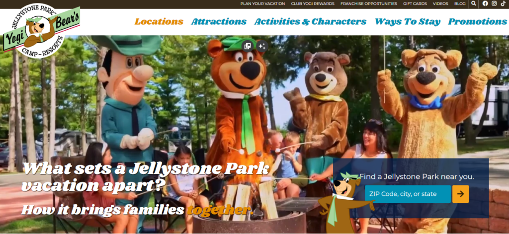
Jellystone Park’s website is bright, fun, and engaging, reflecting the family-friendly atmosphere of its campgrounds. From the moment visitors land on the page, they are greeted with playful colors, large images, and interactive features that highlight the fun activities available.
What Makes It Stand Out?
- Vibrant, playful design: The use of bold colors and exciting imagery creates a sense of adventure, perfectly aligning with the brand’s family-friendly appeal.
- Large, engaging photos of activities and amenities: The website highlights kid-friendly attractions, such as water parks, themed events, and interactive play areas.
- Smooth booking process: With clear, highly visible CTAs, visitors can easily find and book their stay without confusion.
- Interactive map for easy exploration: The map feature allows users to browse different Jellystone Park locations across the country, making it easy to plan a trip.
5. Dos Rios RV Park
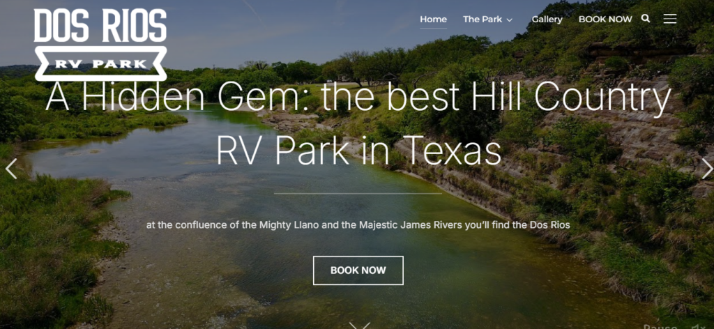
The website of Dos Rios captures the laid-back, adventure-driven experience through stunning riverfront photography and a simple, user-friendly interface. The design prioritizes tranquility and outdoor adventure, with a focus on kayaking, fishing, and stargazing under some of Texas’ darkest skies.
What Makes It Stand Out?
- Scenic and rustic visual appeal: The site’s earth-toned color palette and high-resolution nature photography emphasize the beauty of the Llano River and surrounding landscapes, immediately immersing visitors in the outdoor experience.
- Minimalist yet effective navigation: A straightforward menu with key sections like “Ways to Stay” and “What We Offer” ensures that visitors quickly find the information they need without distraction.
- Fast and simple booking process: The “Book Now” button is highly visible, leading guests directly to a streamlined reservation system where they can select dates and accommodations with ease.
- Localized SEO and adventure-focused keywords: Optimized with “Hill Country RV park,” “Llano River camping,” and “best kayaking spots in Texas,” the site successfully attracts outdoor enthusiasts searching for a secluded, nature-filled getaway.
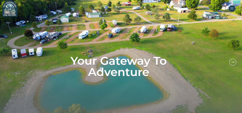
6. Misty Mountain RV Park
Misty Mountains RV Park captures the essence of adventure with a stunning, nature-inspired website that blends breathtaking visuals, seamless navigation, and a strong brand identity. Nestled in the rolling hills of Western New York, this campground offers a perfect mix of rugged outdoor experiences and modern conveniences, making it an ideal getaway for RVers, tent campers, and cabin lovers alike.
What Makes It Stand Out?
- Breathtaking Scenery & Branding: The site immerses visitors in the park’s misty mountain charm with high-quality imagery of lush forests, peaceful ponds, and cozy campsites. Its welcoming tagline, “Your Gateway to Adventure,” reinforces the campground’s promise of exploration and relaxation.
- Engaging Features & Amenities: A standout interactive “What To Do” section showcases local activities like boating, fishing, hiking, and biking, making trip planning easy and exciting. The site also highlights spacious full-hookup RV sites, rustic cabins, and tent camping, all with essential amenities like free Wi-Fi, fire pits, and a dog-friendly park.
- Simple Navigation & Easy Booking: A well-organized menu ensures that key information is quickly accessible, from amenities to rates. With a clearly visible “Book Now” button, reserving a stay is effortless, whether on desktop or mobile.
- Community & Charitable Impact: Beyond camping, Misty Mountains fosters a welcoming community and gives back through its Listening to the Children initiative, providing stays for families and veterans in need.
How to Create the Best RV Park Website for Your Business
A well-designed RV park website is essential for attracting guests and increasing bookings. Design, usability, and functionality will help you create a seamless experience for visitors. By implementing clear navigation, strong visuals, and an easy-to-use booking system, you can make your website work for your business 24/7.
Simplifying Your Design Process
A clean and intuitive website design ensures that visitors can find the information they need without frustration. Overcomplicated layouts, excessive pop-ups, or cluttered pages can overwhelm users and drive them away.
Instead, prioritize a simple structure that guides visitors toward making a reservation. Using website templates from platforms like WordPress, Wix, or Squarespace can help speed up the process while maintaining a professional look.
Incorporating the Key Elements
A high-performing RV park website needs clear navigation, mobile optimization, fast load times, strong CTAs, and accessibility. These elements improve the user experience, increase bookings, and build trust with potential guests.
1. User-Friendly Navigation: Your website should be simple to explore with a clear menu for booking, amenities, and rates. Add a search bar for quick access to information, and use sticky menus that stay visible as users scroll. Breadcrumb trails help visitors track their navigation.
2. Mobile Optimization: Most travelers book from their phones. Use a responsive design that adjusts to all screen sizes. Choose a mobile-friendly template on WordPress, Wix, or Squarespace. Ensure buttons like “Book Now” are large and easy to tap.
3. Fast Load Times: Slow websites lose visitors. Compress images with Tiny PNG and reduce plugins and scripts that slow performance. Use a caching plugin and a reliable web host to speed up loading times.
4. Clear Calls to Action (CTAs): Make it easy for visitors to book. Use bold buttons like “Book Now” and place them in multiple spots—top of the homepage, amenities section, and footer. Avoid vague text like “Learn More”—use action-driven CTAs like “Reserve Your Spot Today.”
5. Accessibility and inclusive design: Ensure everyone can use the site. Use high-contrast colors, readable fonts, and alt text for images. Avoid flashing animations or autoplay videos. Make sure all buttons and forms work with a keyboard for assistive technology users.
Tools and Resources to Help You
You can build a good RV park website with the right tools. Website builders like WordPress, Wix, and Squarespace offer customizable templates that make designing your site easier. For those who prefer a more hands-off approach, an AI website builder can automatically generate and optimize a website based on industry best practices. Stock photo websites provide high-quality images to make your site look better, while SEO tools help you improve content for better search engine rankings.
Integrating mobile optimization plugins and booking system integrations can improve functionality, ensuring a smooth experience for users. Investing in these tools and resources can help your RV park get more guests and make more money.
Improve Your RV Park’s Website with RoverPass Premium Website Services
A well-designed website helps RV parks attract guests and make bookings. A professional, SEO-optimized website ensures that potential visitors can easily find your park, explore its offerings, and complete reservations without hassle.
With RoverPass Premium Website Services, campground owners can create high-performing websites that improve the user experience, visibility, and operational efficiency. A website that is built well removes barriers that may stop visitors from booking.
A website should work for you, not against you. Investing in a well-optimized, professionally managed site ensures that potential guests have the best experience possible—from their first search to finalizing a reservation.
Frequently Asked Questions
How can campground owners improve the user experience on their RV park website?
Keep navigation simple and intuitive, ensure fast load times, and use high-quality images to create a visually appealing and easy-to-use site.
What design features should campground owners focus on to increase bookings?
Prioritize clear CTAs like “Book Now,” mobile-friendly design, and an easy-to-navigate layout. Use high-quality images, compelling descriptions, and an interactive map to engage visitors and encourage reservations.
How to make the RV park website mobile-friendly?
Use a responsive design that adapts to different screen sizes; ensure buttons and text are easy to read and tap.
How to speed up the website’s loading time?
Yes, by compressing images, minimizing plugins and scripts, and using a caching plugin or content delivery network to improve performance. A reliable hosting provider also ensures faster load speeds.
How to optimize the RV park website for local search?
Include location-based keywords, claim and update your Google Business Profile, and add your park’s name, address, and phone number consistently across all online listings.
Use RoverPass Premium website solution to experience a seamless, user-friendly experience tailored specifically for campgrounds, RV parks, and glamping resorts.


